With the publication of the revised edition of Hawks in Flight, I wanted to post a little bit about my drawing technique with pen and ink.


I’ve always enjoyed black-and-white drawing. I remember being in third grade and spending hours looking at Earl Poole’s ink drawings in James Bond’s “Birds of the West Indies”. A few years later I was enthralled by the simplicity and grace of George Sutton’s drawings in “Fundamentals of Ornithology”.
Ink was my favorite “formal” medium from my childhood through my late-20s when I started doing a lot more painting. My first paid job as an artist was doing drawings for travel brochures, like the elephant shown above (drawn from photographs when I was about 17) and all of my early published art was pen-and-ink drawings.
I was drawing with a pencil almost every day in the field, and cross-hatching was a major part of my pencil shading technique, so the transition from pencil to ink was very easy for me. By the time I started the drawings for Hawks in Flight (when I was about 24) I had a well-developed style.
The materials I use now are the same ones I used in the 1970s: a bottle of India Ink, a crow-quill pen nib in a handle, and a watercolor brush for painting ink in large areas, and I work on smooth white paper.

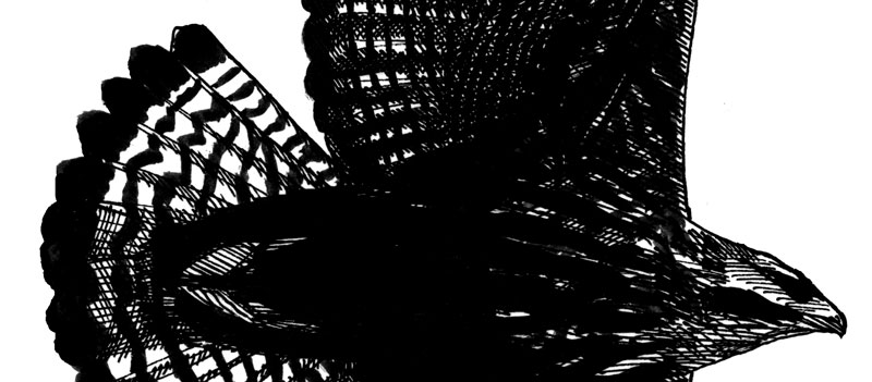
I only use one pen size, either 0 or 00, making very fine lines. I can vary the thickness of the lines slightly by putting more pressure on the pen, and I use the brush when I want to fill in large areas of black, but otherwise I just build up darker colors by adding more cross-hatching.
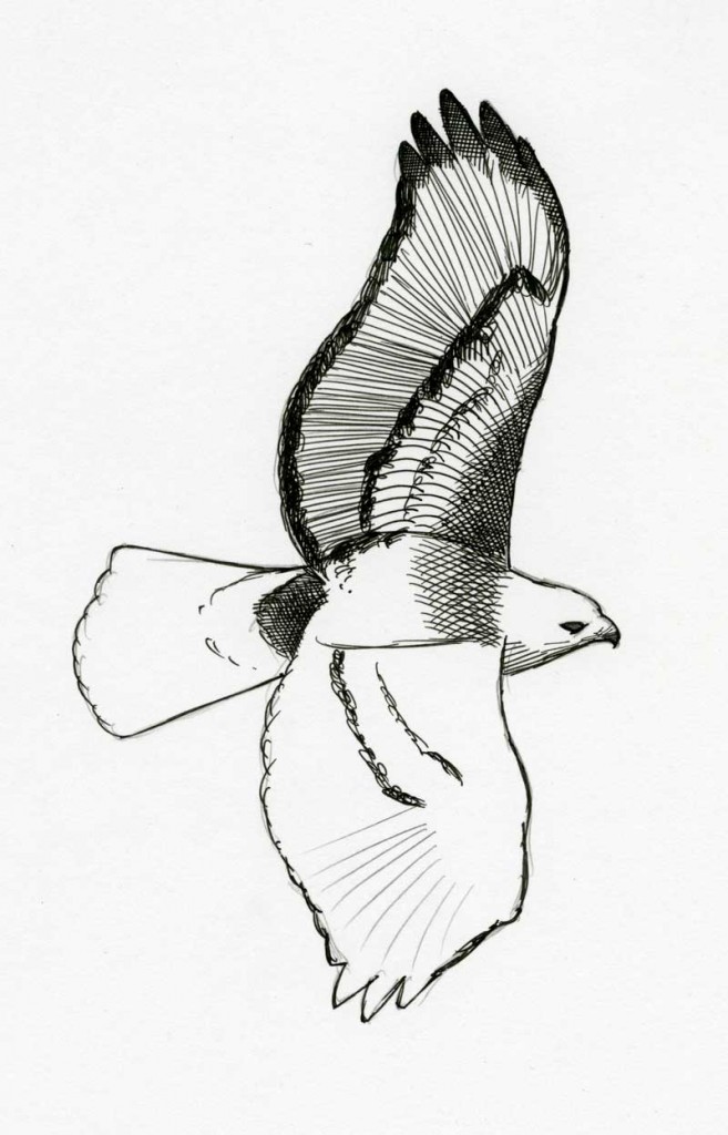
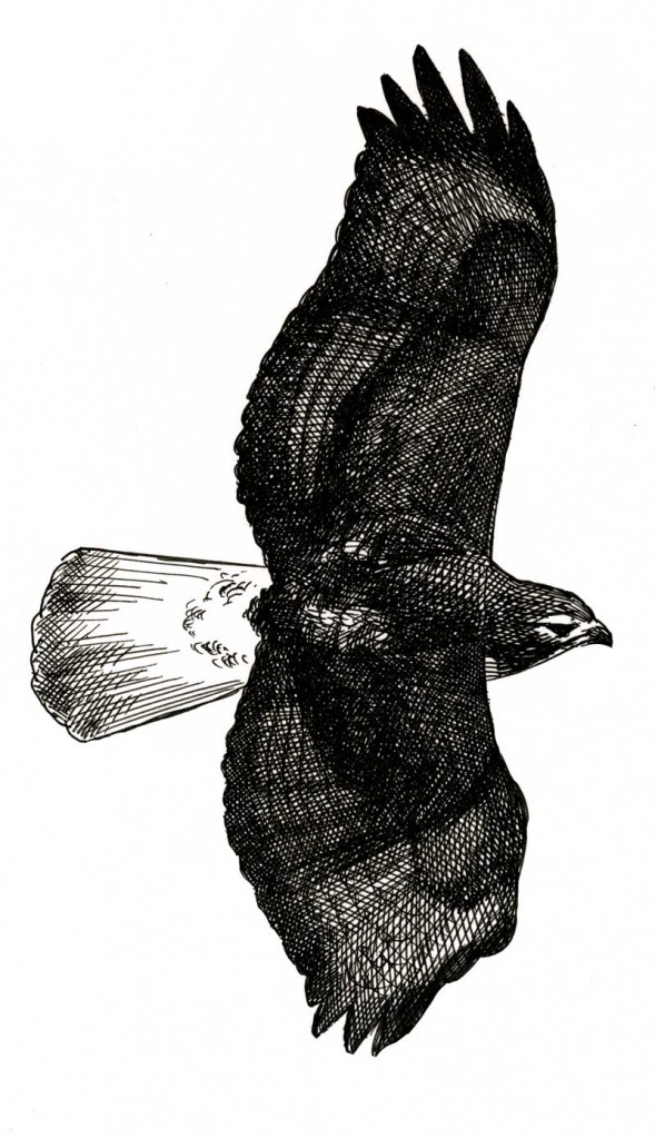
Every drawing begins with a very simple pencil outline. The first lines with a pen simply trace the outlines, then I start adding “structural” lines that will define the contours of the bird – feather shafts are a major defining feature of the contours. Next I’ll work on some of the darkest areas, adding ink with a brush or adding multiple layers of cross-hatching to build up a darker color.
In a color painting I generally work across the entire painting at once, adding a layer to all parts of the bird. But in pen-and-ink I find that it’s easier to add layers in one small area and complete one section, like a wing, then move on and start another section.
In the final stage I sit back to look for rough edges or distracting dots of white in areas that are supposed to be dark, and once those are filled in (try to resist the temptation to keep adding more ink) it is finished.
Below are some close-ups of drawings from Hawks in Flight, where you can get a better sense of the actual process.
I use a similar technique when I paint. I work exclusively on photoshop using the paint part of he software. I also have done some needlework and use the same techniques to get the structure of the subject. The thread catches the light and different angles, and is very effective. Always nice to see other artists at work
I also love the pen technique though my ability doesn’t even come close to yours. The amount of detail and layering you achieve with this technique is impressive.
As someone who struggles to draw a stickman, I’ve sometimes wondered how the apparently effortless drawn illustrations in bird books were achieved. I found this very informative. All the best from Rollin Harbour
Pingback: zwart wit contrast en arceren | snorrepost
Pingback: Pen Drawing Graphics – Viral craft
Pingback: Pencil Drawing Tools | Cros Roads Centers